Creating a peaceful and relaxing environment at home starts with the colors you choose for your walls and decor. Calm colors can make a significant difference in how a space feels, helping to reduce stress and promote comfort. Whether you’re redesigning your living room, bedroom, or any other area, understanding how to select calm colors is essential. In this post, we’ll explore practical tips and ideas to help you choose colors that bring tranquility to your home.
Why Choose Calm Colors?
Colors influence mood and perception. Calm colors—often soft, muted, or pastel tones—convey a sense of relaxation and serenity. When you opt for these shades, your rooms can feel more inviting, balanced, and harmonious. This is especially valuable in busy households or spaces meant for rest and unwinding.
Understanding Color Psychology
Before diving into specific colors, it’s helpful to know a little about color psychology—the way colors affect our feelings.
– Blue: Often associated with calmness and stability. It tends to lower heart rates and create a sense of peace.
– Green: Reminds us of nature and growth. It’s restful for the eyes and promotes balance.
– Gray: Neutral and soothing. It provides a subtle backdrop without overwhelming senses.
– Beige and Soft Browns: Warm and grounding, these colors can add coziness without intensity.
– Lavender and Soft Purples: Gentle and nurturing, they can encourage relaxation without feeling too bold.
While these associations aren’t strict rules, they offer useful guidance when considering your palette.
Tips for Choosing Calm Colors
1. Start with Natural Inspiration
Look around you for inspiration in nature—a lush forest, a clear sky, or a gentle beach. Natural colors tend to be inherently calming because they connect us with outdoor environments. Think soft greens, sky blues, and sandy neutrals as potential color foundations.
2. Consider the Room’s Purpose
Different spaces call for different moods:
– Bedroom: Ideal colors include soft blues, muted greens, and pastel lavender to encourage restful sleep.
– Living Room: Warm neutrals, gentle grays, or pale greens create a welcoming and relaxing area.
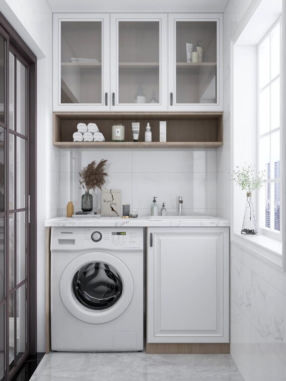
– Bathroom: Light blues, seafoam greens, and whites evoke cleanliness and calm.
– Home Office: Balanced tones like muted blues or greens can help with focus without overstimulation.
3. Use Light to Your Advantage
Natural and artificial lighting affect how colors appear. Test paint samples in different lighting conditions throughout the day to ensure the color remains soothing and not too dark or intense.
4. Choose Muted or Pastel Shades
Avoid overly bright or highly saturated colors, which tend to energize rather than calm. Muted or pastel shades with gray undertones often work best for a tranquil atmosphere.
5. Create a Harmonious Palette
Use color combinations that complement each other without clashing. For calmness, stick to analogous colors (colors next to each other on the color wheel) or a monochromatic scheme (various shades of the same color).
6. Incorporate Neutrals for Balance
Neutral colors like off-white, cream, taupe, and soft gray help balance stronger calm colors and prevent overstimulation. They can be used on walls, trim, or larger furniture pieces.
7. Test Before Committing
Before painting an entire room, test colors on a small section of a wall or with large color swatches. Observe how the colors look at different times—morning, afternoon, and evening.
8. Don’t Forget Texture and Materials
Colors can appear differently depending on the texture and finish of the surface. Matte finishes tend to be softer and less reflective, contributing to a soothing environment. Incorporate natural fabrics and materials to enhance the calming effect.
Popular Calm Color Ideas for Your Home
Here are some popular calm color choices that work well in many homes:
– Soft Sage Green: Brings a hint of nature indoors.
– Pale Blue: Reminiscent of the sky, promotes relaxation.
– Light Gray: Neutral and versatile for any room.
– Warm Beige: Cozy and inviting without being overwhelming.
– Lavender Mist: Adds a subtle, peaceful touch to bedrooms or bathrooms.
Using Calm Colors Beyond Paint
Apart from walls, you can introduce calm colors through:
– Furniture: Sofas, chairs, and tables in soft hues.
– Textiles: Curtains, rugs, pillow covers, and throws.
– Artwork and Accessories: Framed prints or decorative items in pastel shades.
– Plants and Natural Elements: Greenery naturally enhances calmness.
Final Thoughts
Choosing calm colors for your home is a wonderful way to create spaces that feel welcoming, soothing, and balanced. By understanding color psychology and considering your lifestyle and lighting, you can select colors that truly bring peace to your living spaces. Take your time with samples, incorporate natural inspirations, and don’t be afraid to combine neutral tones with a touch of color for harmony. The result will be a home where you can relax and recharge every day.
Happy decorating!